top of page
SMART LIFE
Responsive Smart Home App
OVERVIEW
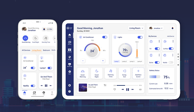
Smart Life is a company that combines innovative solar energy and smart home technologies.
As part of this project, my focus was on resolving UX challenges related to the Smart Life app. This involved conducting extensive research into the complexities of smart home systems, as well as designing the most efficient control and operation features for the app to ensure an optimal user experience.
ROLE
UX Research
UX Adjustments
UI Design
Concept project designed as a part of a UX/UI course 2022
Provided Wireframes (by Codesigner)
Smart Life is an application that offers users the convenience of controlling and managing their smart devices. With this app, users can easily connect to a broad range of smart devices and customize their settings to enhance their performance.
These wireframes represent the two main screens that were provided to me as a starting point for this project:
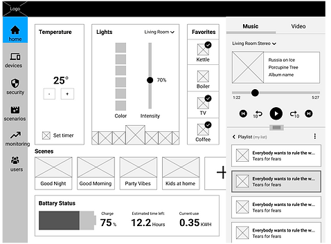
Home Screen
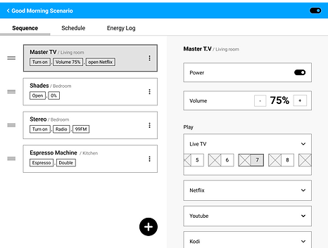
"Good Morning" scenario screen
Understanding the Problem
The screens provide the user with required information, but the user interface presents a significant challenge:
-
The home screen contains an excessive amount of information and options, leading to cognitive overload for the user. As a result, the interface is not intuitive.
-
The lack of room sections on the home screen can lead to confusion for users who are trying to identify which device corresponds to which room.
Competitive Analysis
In the research, I used two main approaches:
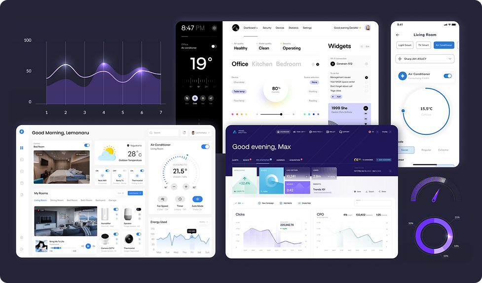
Benchmark of existing applications to emulate behavioral models and conventions in the field, and visual research of dashboards and infographics to gain graphic inspiration for the app design.
Benchmark

Gaining an understanding of the functionality, user experience, and flow of smart home apps, as well as researching their various features.
Visual Research
Collecting a range of visual references for inspiration and creating a mood board with a combination of colors, themes, shapes, typography, and icons.
Insights
While analyzing other products, I took note of features and design patterns I might want to include in my app and the design rationale behind them:
Most smart home apps organize devices into groups and rooms, allowing users to efficiently access the devices they regularly control. This organizational strategy can enhance the user experience by minimizing the time and effort needed to locate and adjust specific devices.

By allowing users to select room types directly from the home screen, many apps make it easier to navigate all rooms on a single page.

The apps allows the user with fast access to commonly used actions, such as switching devices on/off, can simplify users' interaction with the app.

Target Audience
Users Age:
40-65 years old
technological skills:
High Level
App Use:
Personal Home
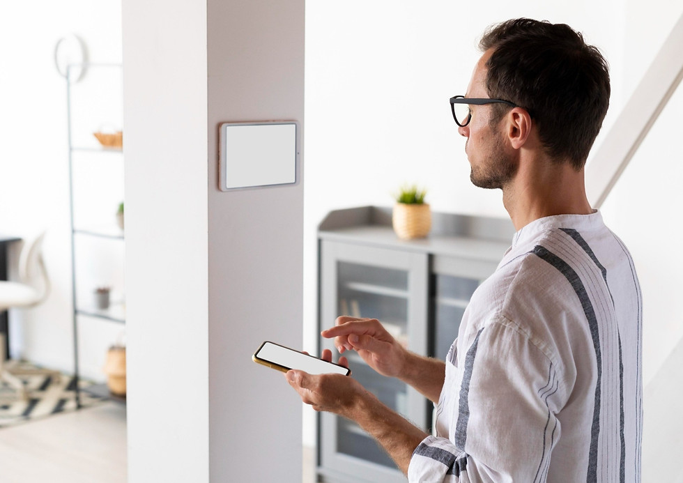
App Devices: mobile, tablet & desktop
Goals
-
Simplify the user interface to reduce cognitive overload.
-
To design a user-friendly interface with intuitive navigation that efficiently reduces the number of steps required to complete common tasks.
-
Designing the app's UI to create a more modern and visually appealing interface.
Ideation Process
After conducting a competitive analysis and defining the product goals, I created new solutions to meet the requirements of the home screen:

Visual Design
Style Guide
The visual design was inspired by several mood boards, with a color palette selected to best represent the control widgets and data visualizations with a clear and intuitive interface.

High Fidelity Screens
-
UX adjustments were made and UI design was improved for the dark and light home screen of the tablet, as well as the "good morning" scenario screen.
-
A responsive mobile app screens was designed with both light and dark modes.
-
A desktop dashboard has been created to provide users with data on energy consumption across various categories.
Project Conclusions
What have I learned?
-
Reduction of cognitive overload- I divided the main screen into sections and created a clean and functional design, resulting in an intuitive interface.
-
Using data visualization tools- Using data visualization tools can enhance clarity and comprehension, especially when dealing with large amounts of data. They enable effective communication of information to users and increase engagement.
-
Responsive Design- To ensure the best possible user experience for this system, it is important to pay specific attention to the features of each platform and implement a progressive disclosure strategy for the main and secondary screens.
bottom of page


